

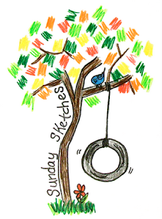
ended up turning in the two above, though I at one point preferred the two at the bottom
this was the 2nd logo attempt. Still hunting down the 1st one I turned in...
the flaw of the first one - it didn't mean anything and the colours screamed McDonald's. THe second one has meaning, in that I've spent 1/2 my life in south america, and 1/2 my life here, and I feel I belong to both equally. Also better integration of letters to object, whereas in the previous logo, the letters were floating in space.
I like the antiqued look of the colors as well, reminds me of old textbook I enjoyed while very young





 Posts


No comments:
Post a Comment